Appearance
Labels
Pressing the Label icon  brings you to Labels.
If you don't already have labels in your file or your Library, the interface will have this at the center.
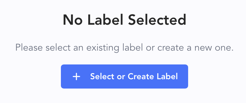
Touch + Create New Label and a popup appears.
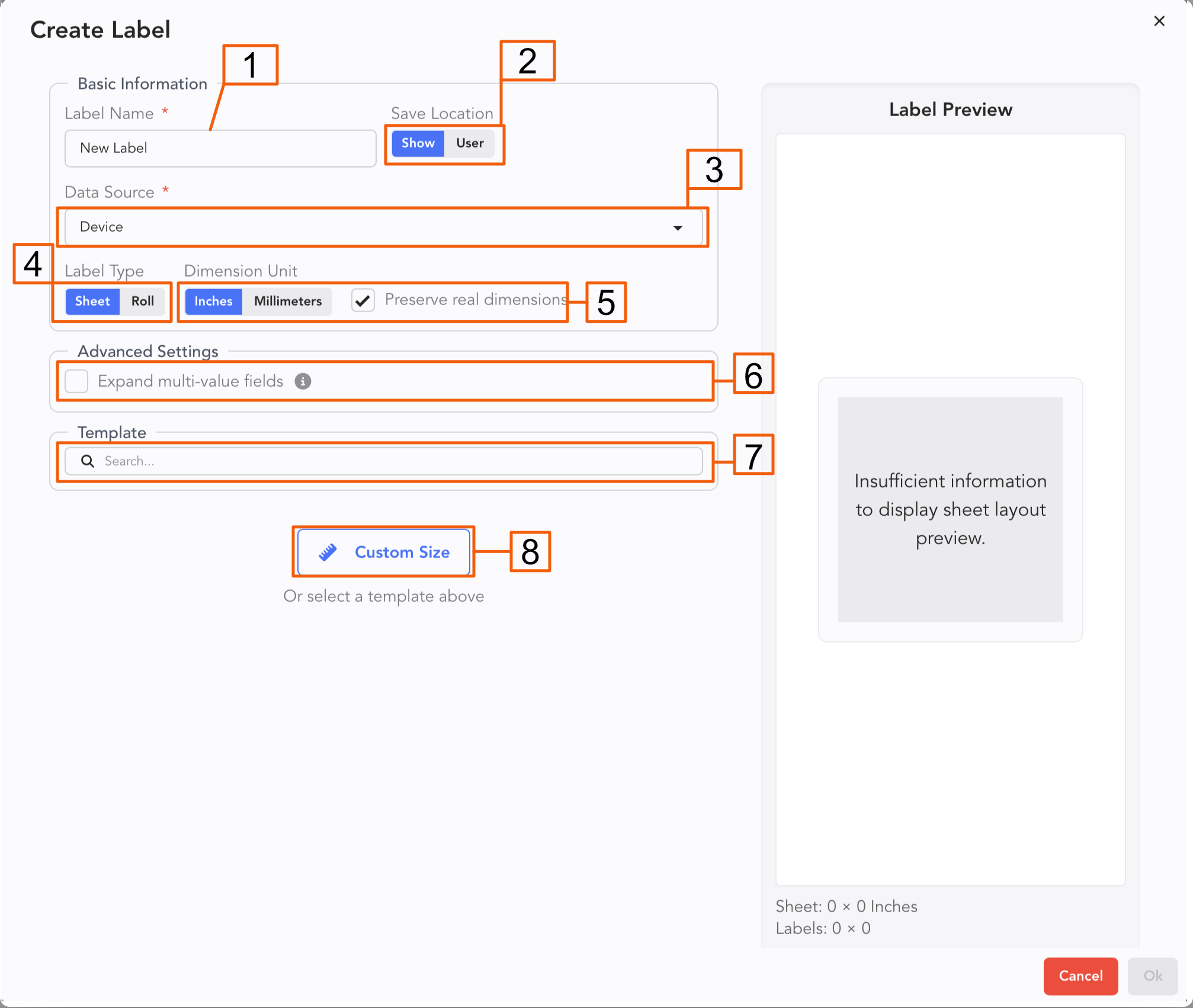
Label your Label. Consider adding both the purpose and the size for your label.
The Label can be created just for this show or for you as a User. User will mean the Label will be available across your account and devices. If you start with a Label in your Show and want to move it to your Library, you can later.
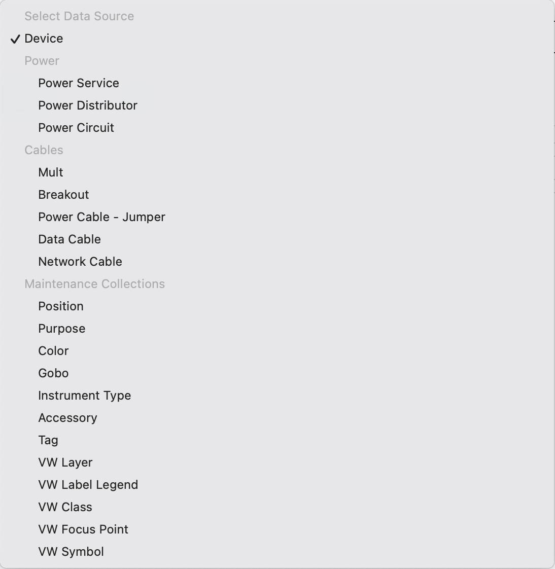
Data Source-- most labels are device labels (Fixtures, Gateways, etc.) But labels for your cables or Power distros, for example, would need to pull from different parts of your Lightwright file. You choose that here.
Label Type-- Lightwright now supports roll printers! Of course, it also still supports standard sheet labels.
Dimensions-- Metric, Imperial and the option to real dimensions regardless of how you choose to view your measurements.
Expand multi-value fields-- when selected, you can use list fields (such as User Columns or Tags) to produce multiple labels, one for each value.
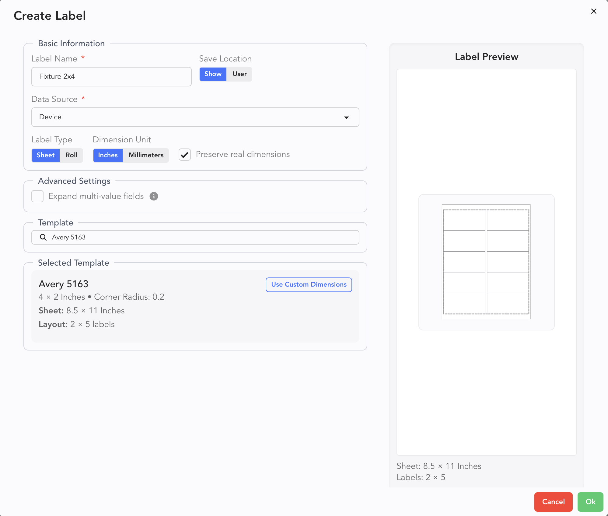
Template-- it is highly recommended for typical labels to use template to choose your label size.
Custom-- if your label size isn't covered by a template, specify your own.
Once you have made choices, Lightwright previews what your template will look like.
If things look good, click Ok.
The Label Editor opens.
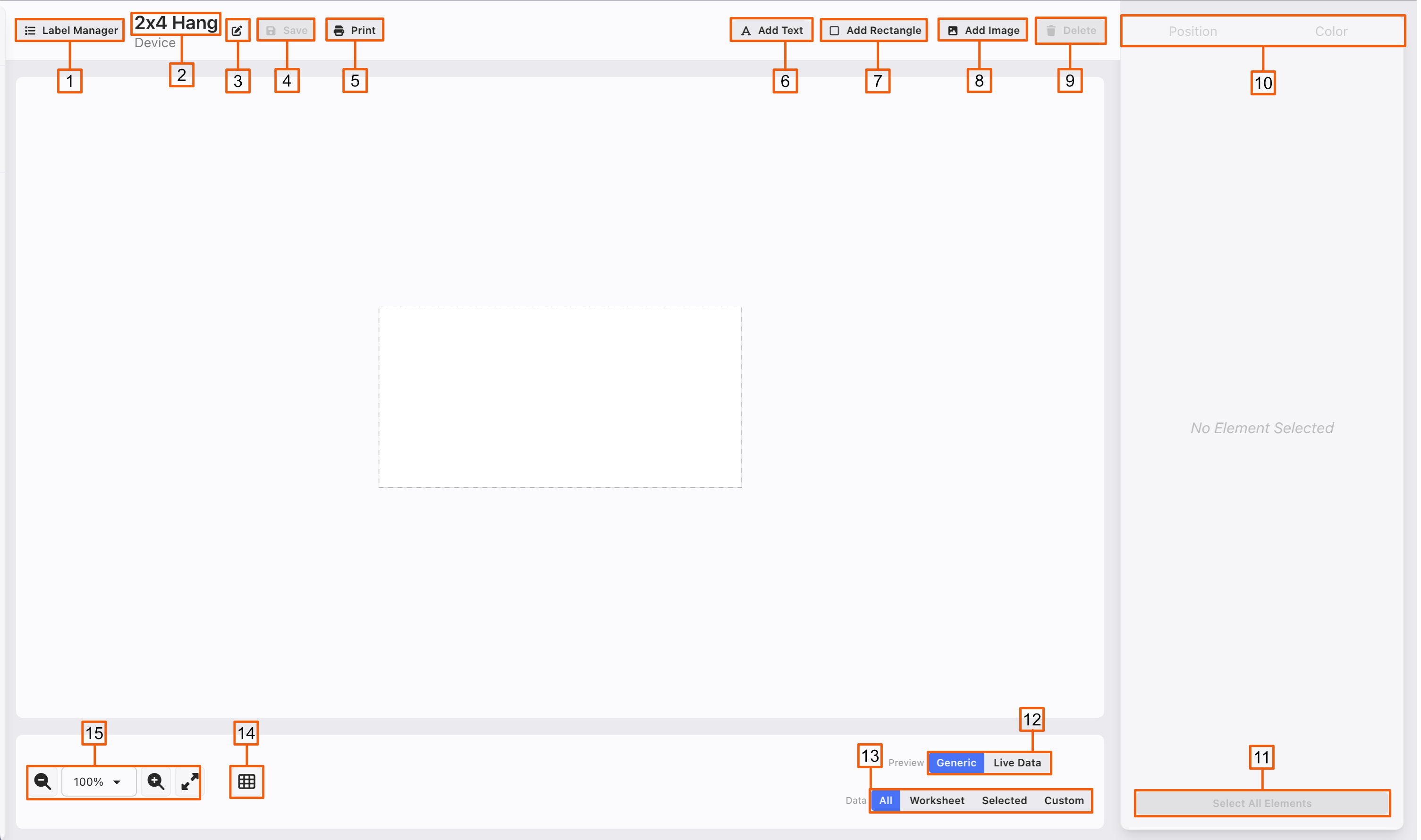
Label Manager-- opens the label Manager on the left.
This is the name of the label you are editing.
Touch this icon to rename your label.
Save
Print-- to your Printer or to PDF.
Add Text-- to add a text field, whether custom or from a field in Lightwright, touch this.
Add Rectangle
Add Image-- can be the Show Image or a Custom Image.
Delete-- you can also use the Delete on your keyboard.
Tabs for the selected Text, Rectangle or Image. Constant tabs are Position and Color. Text and Image appear as tabs when you are selected on the respective field.
Select All Elements-- allows you to edit all elements at once.
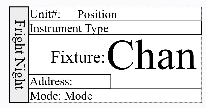
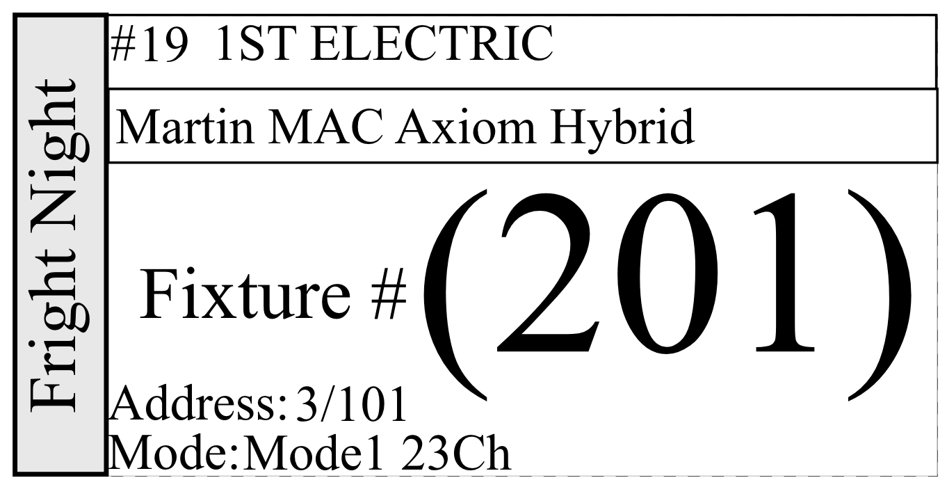
Generic/Live Data-- toggles between the category of text (for example Position) or the actual data from your worksheet (for example, 3rd Electric). It's important to test with actual data, since something that looks wrong in Generic can look great in Data.
- Filter Options-- allows you to work with and view only the Devices you want.
- All-- includes all Devices
- Worksheet-- allows you to filter the Worksheet any way you wish and then use that to populate your Labels.
- Selected-- Selections in the Worksheet populate your labels.
- Custom-- Opens a Side panel that allows you to filter from any category to get the exact data you want. Below i
Snap Grid-- toggle and customize a snap grid to help you keep your labels neat.
Zoom + -, a pull-down sizing menu, and Zoom to fit.
Tab Controls- Text
Once you add a Text object, the Side Panel populates with options across the three tabs.
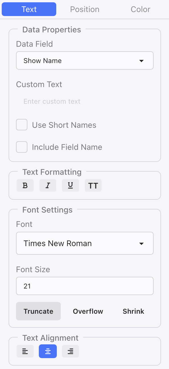
- Data Field-- choose from the pull-down list a Column Header item and Lightwright will populate the data.
- Custom Text-- if you don't choose a Data Field, Lightwright will default to a Custom Text. This is where you would enter that text.
- Use Short Names-- to conserve space, tick this option.
- Use Field Name-- to add the Data Field Name prior to your data. Example: Channel (101)
- B makes your text bold.
- I puts your text in italics.
- U underlines your text.
- TT capitalizes your text.
- Font-- choose any font on your computer.
- Font Size
- Truncate-- Cuts off any text that would land outside the text box but does not change text formatting.
- Overflow-- Shows all the text present with the formatting supplied even if it extends beyond the text box.
- Shrink-- Shrinks the text to fit the existing text box size.
- Text Alignment- Left, Center or Right
Tab Controls- Position
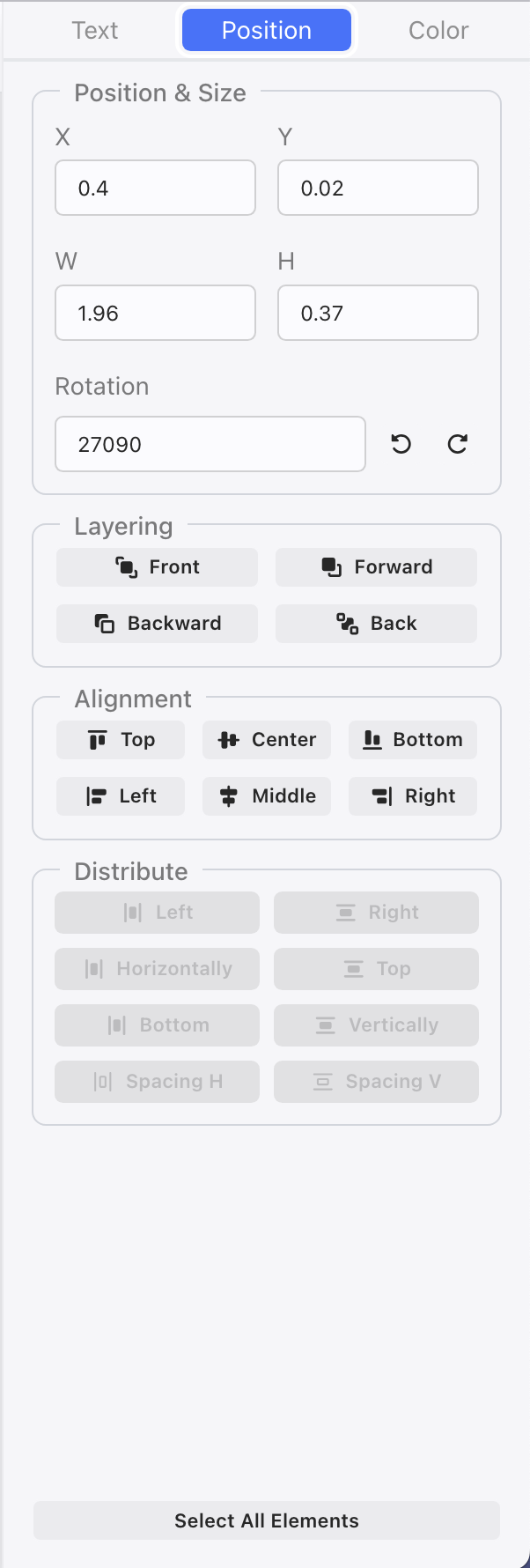
- X/Y- is the position data for your object.
- W/H- width and height of your object.
- Rotation-- note you can type in a rotation value or use the Rotate left or right 90 degrees shortcuts.
- Layering-- similar to drafting or photo editing software, you can choose whether an object moves forward or backwards in layer.
- Alignment-- places your object on the label. When you have selected one object, Alignment will align the object with the Lable. When selecting more than one object, this will align the objects to each other.
- Distribute-- great for keeping things neat. Select more than one object at a time to make good use of these options.
Tab Controls- Color
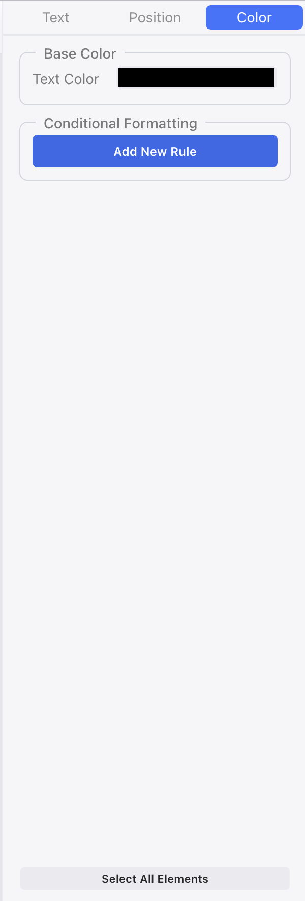
- Text Color-- choose color for the text of your object.
- Fill Color-- choose the fill color when your object is a rectangle.
- Stroke Color-- choose the line color when your object is a rectangle.
- Stroke Width-- line thickness for rectangle objects.
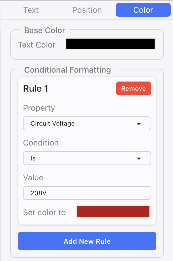
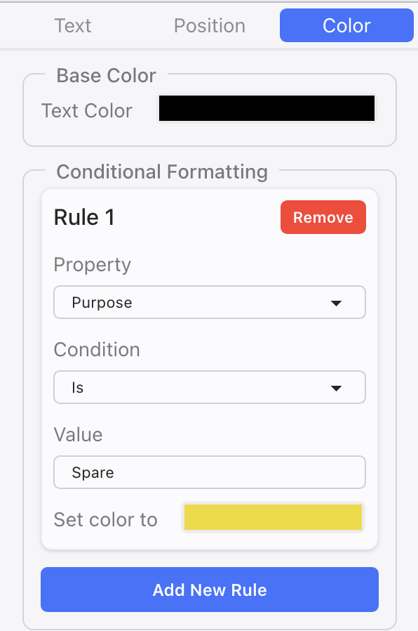
- Conditional Formatting- a series of rules you can input to have certain conditions result in certain colors. Can be for Text or Rectangle objects. Here are two examples of conditional formatting:
- Select Image Type-this can either be the Show Photo or any other image. Choose from the pull-down which to start with.
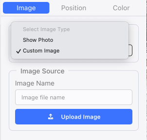
- Upload image